.jpg)
30 Second Summary
- Font selection plays a crucial role in sports uniform design, enhancing team identity and ensuring the field's visibility of names and numbers.
- The article highlights 13 standout fonts such as Akira, Varsity, and Lemon Milk, each offering unique styles from bold, modern designs to traditional, vintage looks.
- Practical tips are provided for using these fonts, including how to match them with team aesthetics, colors, and uniform elements for an impactful design.
Introduction
A well-designed sports uniform is more than just colors, logos, and patterns; the font you choose plays a crucial role in shaping the team's identity. The right font can elevate the uniform's appearance, making it memorable and eye-catching on and off the field. For sports teams, fonts should be bold, readable, and visually striking to ensure the team stands out.
Selecting the best font for football, basketball, or school teams is essential for creating a cohesive and powerful look. To help you design standout uniforms, here is a list of the 13 best fonts for sports uniform concept designs. From bold numbers to stylish names, these fonts will make your uniforms unique.
1. Akira: A Bold Statement for Any Team
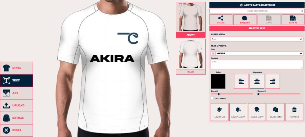
Akira is a sans-serif font that exudes power and confidence. Its bold, modern design is perfect for teams that want to make a strong statement on and off the field. With thick strokes and sharp edges, Akira projects a sense of determination and focus—qualities essential for any sports team aiming for success.
Akira’s simplicity is one of its greatest assets. The clean lines ensure the font remains highly readable, even from a distance. This is a crucial feature for custom sports apparel, where legibility is essential for fans and players. Akira gives the uniform a modern and futuristic appeal, whether used for player numbers, team names, or even promotional material.
Why Akira Stands Out in Sports Design:
- Bold and impactful: Commands attention and projects strength.
- Clean lines: Ensures readability from any distance.
- Versatile: Ideal for various sports, from soccer to basketball.
Akira is an excellent option for player numbers on the back or sleeves. Consider pairing Akira with a futuristic logo design to emphasize your team’s forward-thinking approach.
2. Energy: Infuse Passion into Every Game
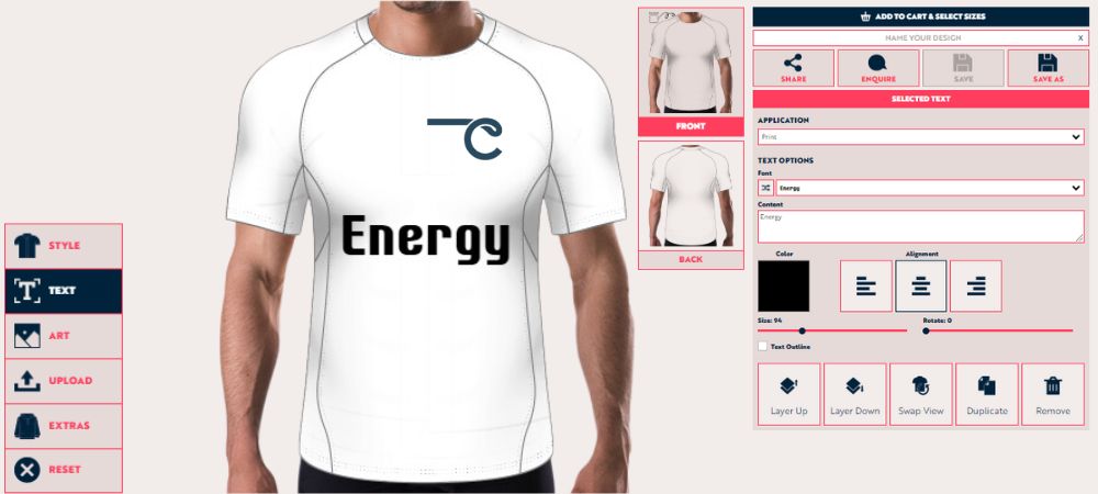
Energy is exactly what its name suggests—a dynamic, high-energy font that conveys motion and excitement. It captures the fast-paced nature of these sports, making players look swift and decisive even when standing still.
Energy's bold strokes make it highly readable and add character to any uniform design. Whether used for team names or player numbers, this font brings vibrancy and dynamism to the overall aesthetic. Teams that want to exude enthusiasm and passion should consider Energy a go-to option.
Why Energy is a Great Choice:
- High readability: Clear and bold, even at smaller sizes.
- Versatile: Works well for both numbers and names.
For teams that want to emphasize speed and movement, use Energy for player numbers to make them pop. This font pairs well with sleek, modern uniform designs and bold, contrasting colors. It will give custom sports t-shirts a unique appearance.
3. Varsity: The Classic Sports Font for Tradition
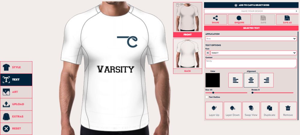
Varsity is an iconic font that has been a staple in sports uniform design for decades. Its collegiate aesthetic instantly evokes a sense of tradition, pride, and team spirit. The blocky, serif design is ideal for sports like football, baseball, or basketball, where heritage and school spirit are integral to the team’s identity. Varsity is the perfect choice for teams that want to honor the legacy of the sport while still looking sharp and polished.
Varsity's thick, bold letters ensure easy readability from the stands, making it a practical option for player names and numbers. Its timeless appeal ensures that your sports t-shirt design will look classic, even as trends come and go.
Key Features of Varsity:
- Classic blocky design: Perfect for traditional sports like football and baseball.
- Collegiate aesthetic: Evokes school spirit and pride.
- Bold and readable: Ensures clarity from afar.
Varsity suits teams that value tradition and want to project a classic look. Use Varsity for player numbers and team names across the chest of Russell Custom American Football Team Jerseys. Pairing this font with traditional colors and stripes can create a timeless uniform design that honors the team’s heritage while still looking fresh.
4. Stencil: A Military-Inspired Strong Font
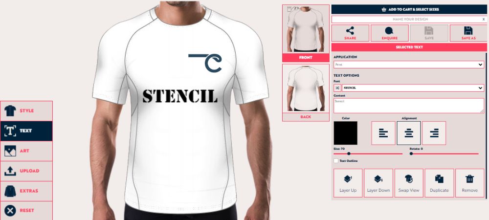
Stencil fonts are often associated with strength, discipline, and order, and Stencil captures all of these qualities perfectly. Stencil's cut-out design offers a rugged, almost militant look, making it an ideal choice for teams that want to convey power and resilience. Sports like rugby, wrestling, or martial arts, where toughness and grit are critical, fit this font perfectly.
The bold, solid structure of the Stencil font makes it ideal for use on numbers and names, providing easy readability while giving uniforms a distinctive, muscular look. The font's military-inspired aesthetic lends a sense of authority and professionalism, which can motivate players and fans.
Why Stencil Works for Sports Uniforms:
- Military-inspired: Projects strength, resilience, and toughness.
- Unique design: The cut-out style makes it stand out.
- Highly legible: Perfect for numbers and names on jerseys.
For teams that want to project toughness and determination, Stencil is an excellent choice for player numbers and team names. Its bold, authoritative appearance works well with darker, more muted color schemes like olive green, black, or navy. Stencil uses aggressive logos, reinforcing the team's strong, no-nonsense identity. It will work best for Hamilton's custom performance baselayer top.
5. Headline: Bold and Dominating Font Choice
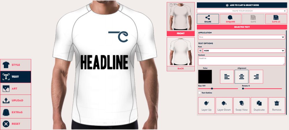
Headline fonts are designed to grab attention, and Headline lives up to its name by delivering bold, wide letters that create an imposing presence. This font is clean, simple, and commands attention, making it an excellent choice for teams that want to project dominance on the field. The wide letters of the Headline ensure that player numbers and names are readable even from the furthest seats in the stands.
The simplicity of the font allows it to blend well with more complex logos and designs, making it a versatile option for many sports. Headline is particularly compelling for sports like basketball or hockey, where the uniform's boldness can reflect the game's intensity.
What Makes Headline Ideal:
- Broad, bold letters: Command attention and ensure readability.
- Clean design: Pairs well with more complex logos.
- Simple yet strong: Perfect for numbers and team names.
Headline is an excellent font for player numbers on jerseys, where size and readability are essential. Its bold, wide design ensures that numbers stand out, even at a distance. Pair this font with solid, simple logos to create a balanced, cohesive look. Consider using the Headline on Madison custom performance tee to emphasize the team’s robust and no-frills approach to the game.
6. Nexa: A Geometric Sans-Serif for Modern Uniforms
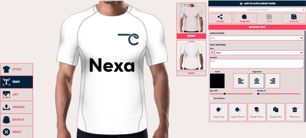
Nexa is a modern, geometric sans-serif font with a sleek, polished look perfect for any sports uniform. Its smooth and proportional letters give it a contemporary feel that works well for teams that want to convey professionalism and modernity. Nexa’s versatility allows it to be used for numbers and team names, creating a unified and cohesive look across the uniform.
The clean, geometric design of Nexa is particularly suited to sports like soccer, volleyball, or swimming, where speed and precision are critical. The font's balanced proportions ensure it remains readable and impactful, even in smaller sizes.
Nexa's Key Benefits:
- Geometric design: Offers a sleek, modern feel.
- Versatile: Works for both player names and numbers.
- Polished look: Adds a professional touch to uniforms.
For teams that value modernity and precision, Nexa is an excellent option. Pair Nexa with bright, contrasting colors to create a sharp, attention-grabbing design that emphasizes your team’s professionalism and attention to detail.
7. Hand of Sean: A Playful Yet Bold Script
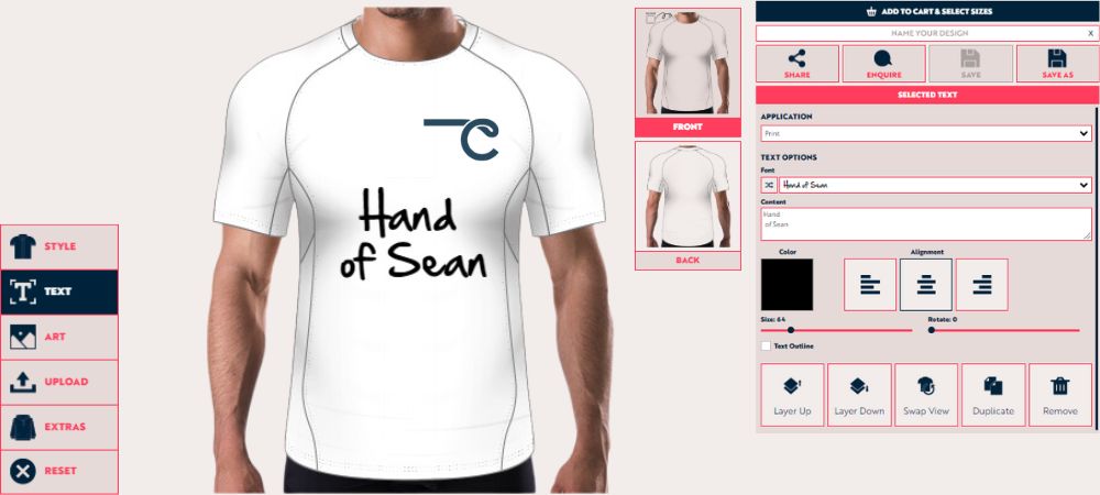
Hand of Sean is a hand-drawn script font that adds a playful, personal touch to sports uniforms. While it has a casual and approachable feel, the bold strokes of this font ensure that it still packs a punch. Hand of Sean is perfect for youth sports teams or informal leagues, where the focus is on fun and teamwork rather than strict professionalism.
This font's handwritten style gives it a unique charm that differentiates it from traditional sports fonts. It works best for team names, as its flowing, connected letters may be challenging to read at smaller sizes, but its boldness ensures that it remains legible at a distance.
Why Hand of Sean Works:
- Hand-drawn style: Adds a personal, creative touch.
- Bold strokes: Ensures readability, even in script form.
- Casual and fun: Ideal for youth leagues or informal sports.
The hand of Sean is best used for team names or slogans across the chest of jerseys or the back of Masters custom performance tennis shirt. Its hand-drawn style adds a friendly, approachable feel, making it ideal for youth teams or community sports leagues.
8. Reey: Stylish and Unique for Modern Teams
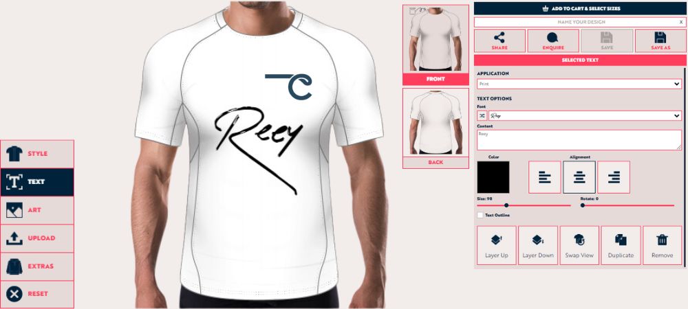
Reey is a contemporary serif font with an artistic flair, combining thin and thick strokes to create a distinctive, elegant look. This font is ideal for teams that want to emphasize style and creativity in their uniforms. Reey’s unique design is best suited for team names or logos, as its intricate details, such as player numbers, can be hard to read at smaller sizes.
Reey is an excellent choice for tennis, golf, or figure skating, where elegance and precision are highly valued. It sets the team apart with its sophisticated and polished appearance.
Key Features of Reey:
- Stylish and artistic: Perfect for teams that want to stand out.
- Best for logos or team names: Adds a creative, unique touch.
- Sophisticated look: Ideal for elegant sports.
Reey works best for team logos or names, particularly on Pilsen custom performance golf shirts, hats, or merchandise. Its artistic design lends itself well to sports that emphasize finesse and precision. Pair Reey with sleek, minimalist logos and neutral colors to create an elegant, understated uniform that still stands out.
9. Round Italic: A Softer Take on a Modern Classic
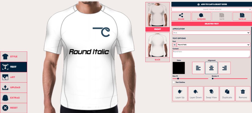
Round Italic is a softer, more dynamic font. With its slanted italic design, this font conveys motion and fluidity, making it an excellent choice for sports where grace and movement are essential, such as gymnastics or swimming.
Round Italic is versatile enough for player numbers and team names, ensuring a cohesive design across the uniform. Its modern yet approachable style makes it an excellent option for contemporary sports teams.
Why Round Italic Works:
- Rounded edges: Creates a softer, friendlier appearance.
- Italic design: Adds a sense of motion and speed.
- Versatile: Works for both names and numbers.
Round Italic is best used for sports that emphasize fluidity and grace. Use this font for player names and numbers to create a cohesive, flowing design. Pair it with sleek, dynamic logos and vibrant colors to emphasize your team's agility and movement on the field.
10. Playball: Classic Script for a Vintage Look
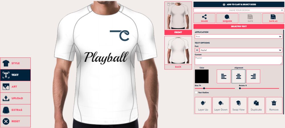
Playball is a vintage script font that brings a classic, timeless feel to any sports uniform. Its flowing, cursive letters give it an elegant, old-school charm, making it ideal for teams wanting to evoke nostalgia. Playball is particularly well-suited for sports like baseball or softball, where tradition and history play an essential role in the team’s identity.
Despite its cursive design, Playball remains bold and readable, ensuring it works well for team names and player numbers. Its vintage feel makes it an excellent option for teams that want to honor the heritage of their sport while still looking polished and professional.
Why Playball is a Solid Choice:
- Vintage design: Perfect for teams that value tradition.
- Flowing letters: Adds elegance and style to the uniform.
- Bold and readable: Works for both names and numbers.
Playball is best used for team names across the jersey chest, where its flowing script can shine. Pair it with traditional colors like navy, white, or red to emphasize the vintage aesthetic.
11. Griena: Sleek and Futuristic for Modern Sports
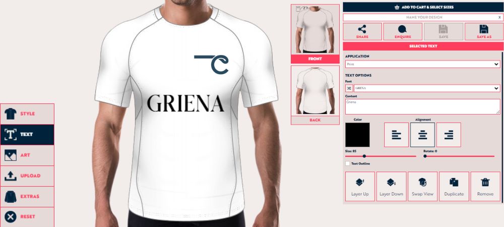
Griena is a sleek, futuristic font that perfectly fits modern sports uniform designs. Its clean, angular lines give it a cutting-edge look, making it ideal for teams that want to project innovation, speed, and precision. Griena works particularly well for sports like cycling or racing, where modernity and performance are critical.
The bold, sharp font ensures readability, even from a distance, making it suitable for numbers and team names. Griena’s futuristic style sets teams apart from traditional designs, giving uniforms a distinctive, modern edge.
What Makes Griena Stand Out:
- Futuristic design: Perfect for teams that value modernity.
- Clean, angular lines: Ensures easy readability.
- Versatile: Works well for both numbers and names.
Griena is best used for teams that want to emphasize innovation and speed. Use the font for player numbers and team names to create a cohesive, futuristic look. Pair Griena with metallic or neon colors to enhance the modern aesthetic and make your team stand out.
12. Ostrich Sans Bold: Tall and Sophisticated
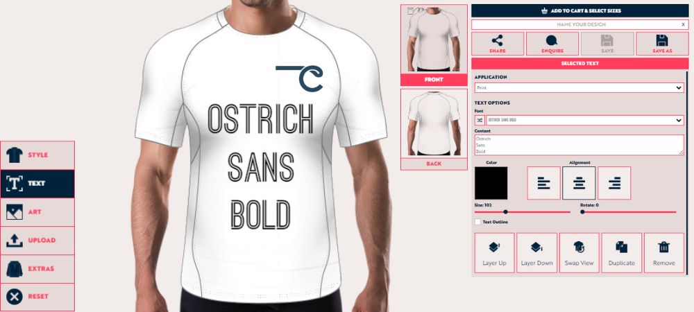
Ostrich Sans Bold is a tall, condensed sans-serif font that brings sophistication and elegance to sports uniforms. Its thin yet bold strokes create a unique balance, making it an ideal choice for sports like basketball or volleyball, where height and elegance are essential. Ostrich Sans Bold’s tall design allows for easy readability, even from a distance, making it perfect for player numbers on jerseys.
The font's sleek, modern design ensures it works well with various uniform styles, adding a touch of refinement and class to any team’s look.
Why Ostrich Sans Bold is Ideal:
- Tall, condensed design: Perfect for sports where height is critical.
- Thin yet bold strokes: Ensures easy readability.
- Sophisticated look: Adds elegance to any uniform.
Ostrich Sans Bold is best used for player numbers on the back of jerseys, where its tall, condensed design can shine. Pair it with minimalist logos and neutral colors to create a sophisticated, refined look. This font also works well for team names on warm-up jackets or merchandise, giving the team a professional appearance.
13. Lemon Milk: A Modern and Versatile Font Choice
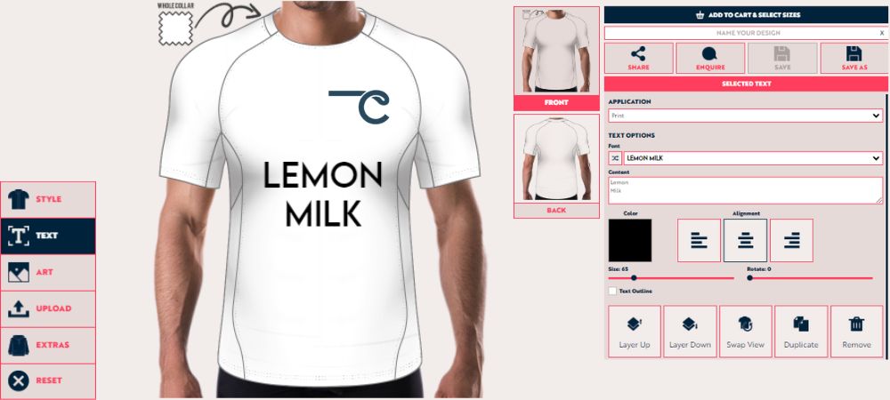
Lemon Milk is a sleek and geometric sans-serif font that has gained popularity for its modern, clean design. With sharp edges and balanced proportions, it brings a sense of precision and sophistication to any sports uniform.
This font is highly versatile, working well for large applications like team names and minor details like player numbers. Its modern design ensures clarity from a distance, making it ideal for fast-paced sports such as basketball, soccer, or hockey.
Why Lemon Milk Stands Out in Sports Design:
- Geometric and clean: Offers a modern, polished look.
- Highly legible: Clear from a distance, perfect for names and numbers.
- Versatile: Works well for various sports, including soccer and basketball.
Lemon Milk is an excellent choice for teams seeking a professional and futuristic design. Its minimalist style pairs well with bold, contrasting colors, ensuring the team’s branding stands out clearly on and off the field.
To Sum it Up
Selecting the best font for a sports uniform concept design requires careful consideration of the team's personality, the sport, and the overall look you want to achieve. Whether your team wants to project strength, speed, elegance, or tradition, the right font will help create a cohesive and impactful look both on and off the field. Choosing a font that aligns with your team's identity ensures that your uniforms look tremendous and resonate with players and fans.
Whether you’re designing uniforms for a professional league, a school team, or a community sports group, CLIFTON Clothing is the right place to create something iconic. From printed text to embroidered logos, you will get it all!
FAQs
1. Why is font choice important for sports uniforms?
Fonts define team identity and ensure names and numbers are readable on the field.
2. What are the best fonts for readability?
Akira, Varsity, and Nexa are bold and clear, ideal for player names and numbers.
3. Can script fonts be used on sports uniforms?
Yes, fonts like Playball and Hand of Sean work for team names but should remain bold and legible.
4. Which fonts suit modern uniform designs?
Griena and Nexa Round Italic are sleek and perfect for modern, fast-paced sports teams.
5. Can I mix fonts in a uniform design?
Yes, mixing fonts for names and numbers works if they complement each other and keep consistency.

 EN
EN NL
NL ES
ES DE
DE FR
FR