Resumen de 30 segundos
- This guide explores the top custom clothing design mistakes that can ruin the final product, especially when working with low-quality print-on-demand services that rely on generic blanks. In contrast, premium providers like Clifton offer bespoke, bulk-ordered garments custom-built from the fabric up.
- It also offers actionable design tips, material insights, and printing guidelines, highlighting premium products from CLIFTON Clothing.
Designing custom clothing is an exciting way to showcase identity, creativity, or team spirit. However, even a small design error can lead to disappointing results or unusable inventory. Whether you’re a business owner, coach, fashion enthusiast, or merch creator, understanding these custom clothing design mistakes can save you time, money, and effort.
Let’s explore the top 10 errors that many designers, both beginners and experienced, make when they design custom tees, hoodies, polos, and performance gear.
1. Printing or Embroidering Over Seam Lines and Uneven Surfaces
Designing over seam lines, zippers, collars, or ribbed areas can ruin the final look, except in garments like Clifton’s sublimated jerseys, where the design is fused into the fabric and cannot peel, crack, or fade. For garments with traditional print methods, seams can distort or misalign graphics.
Text placed over seam lines becomes unreadable, while embroidery across seams might pull unevenly. The issue is even more pronounced on hoodies with kangaroo pockets or zippers, such as the Trafalgar Custom Raglan-Sleeve Hoodie. This hoodie is stylish, but keeping decorations away from seams and raglan sleeves is essential.
Design Tip: Always position your design on smooth, flat sections of the garment. Use the product mockup to visualize how seams affect the layout.
2. Embroidery Detail Too Small or Overly Complex
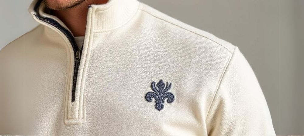
One of the most overlooked custom clothing design mistakes is creating intricate embroidery patterns that cannot be replicated with thread. Fine details look great on screen but fall apart when embroidered.
For example, including a detailed skyline or small lettering on a Solo Custom Piqué Cotton Half-Zip Pullover logo may result in blurry, unrecognizable stitching. Threads have a physical width, so embroidery can’t capture every pixel-perfect detail.
Design Tip: Keep embroidery designs bold and straightforward. Avoid text smaller than 0.25 inches in height, and opt for simpler, larger elements for better clarity in the final product. For performance garments, consider sublimation for intricate designs that need to maintain their integrity.
3. Using Low-Resolution Artwork That Appears Blurry
Always use high-resolution artwork for custom clothing design. Low-resolution images, especially under 150 DPI (dots per inch), can result in pixelated, blurry, or jagged prints.
Even if a logo looks sharp on your screen, it might not print well, and when printed using low-cost methods like heat pressing, it may crack or peel over time. Clifton never uses a heat press, ensuring long-lasting print integrity on garments like the Madison Custom Performance Tee.
4. Ignoring Color Matching Standards Between Screen and Print
Digital screens use RGB colors, while printers rely on CMYK or Pantone systems. If you don’t convert your files appropriately, the final result can look completely different from your preview.
A bright blue on your screen may print as a dull teal. Matching thread color with screen-based mockups is even harder. It’s vital to understand how color translation works when printing or embroidery.
5. Using Illegible Fonts or Fonts That Are Too Small
Typography can elevate or ruin a design. One of the biggest custom clothing design mistakes is choosing fonts that are hard to read, especially when shrunk down or embroidered.
Fonts with delicate swirls or scripts might look appealing in digital designs, but become unreadable in fabric. This is especially problematic on high-performance clothing like the Madison Custom Performance Tee, which requires clarity and functionality.
Design Tip: Choose bold, sans-serif fonts for legibility. Keep font sizes large enough to remain readable even after printing or stitching.
6. Poor Placement, Sizing, or Proportion of Design
Misplaced graphics can destroy an otherwise well-designed garment. Placing a design too high, low, or off-center makes the apparel look awkward and unprofessional.
An oversized graphic on a small tee or a tiny logo on a large hoodie creates an imbalance. Design placement near the collar or placket must be precise for structured polos like the Solo Custom Piqué Cotton Half-Zip Pullover
Design Tip: Use standardized placement guides. Front-center logos usually go 3 inches below the neckline and should not exceed 10 inches wide.
7. Ignoring Material, Color, and Style of the Garment
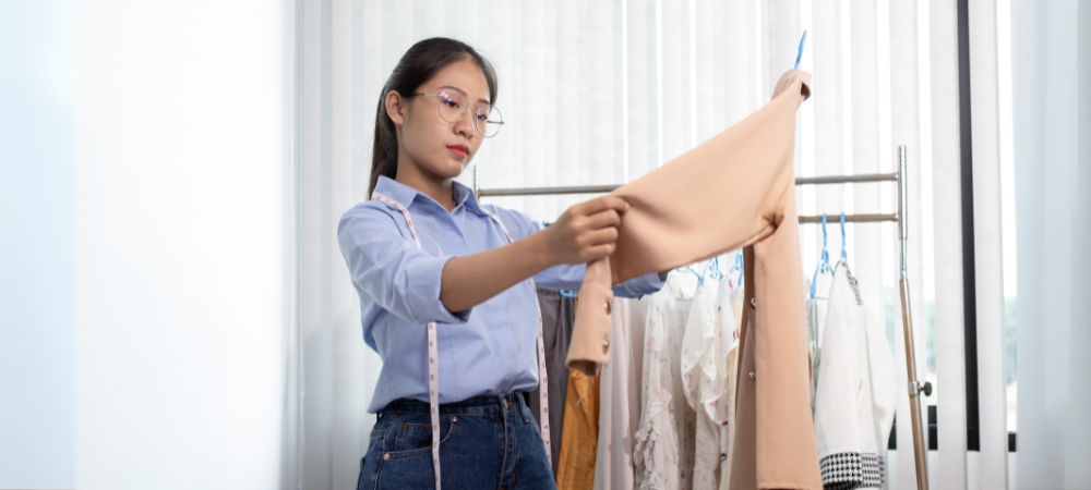
Fabric texture and color impact how a design looks. For example, a shiny synthetic fabric may not absorb ink like cotton, affecting print sharpness.
Designing a dark logo on a navy hoodie, like the Trafalgar Custom Raglan-Sleeve Hoodie, results in poor contrast. Likewise, screen printing on moisture-wicking fabric can crack if the ink isn’t compatible.
Design Tip: Always design for the specific material. Test colors against the garment for visibility and harmony.
8. Overlooking Legal Issues: Copyright and Trademark Infringement
Using copyrighted logos, characters, or brand names without permission is illegal and could result in lawsuits. Many creators unknowingly violate these rights by downloading internet images or copying trending graphics.
Before using any third-party content in your custom clothing, ensure you have the legal rights to reproduce it. Platforms may reject your product entirely if it violates licensing terms.
Design Tip: Create original artwork or use royalty-free sources. When in doubt, consult a licensing expert.
9. Ignoring the Psychological Effect of Color Choices
Color has more meaning than just matching team shades. Poorly chosen colors can send the wrong message, evoke negative emotions, or clash with the intended vibe.
For example, aggressive reds may not work for a wellness brand, while muted earth tones might fall flat for a high-energy sports team. Consider the garment’s use case before locking in colors.
Design Tip: Use color theory to guide your palette. Match colors to the message or activity associated with the garment.
10. Designing Casual Graphics on Professional Apparel
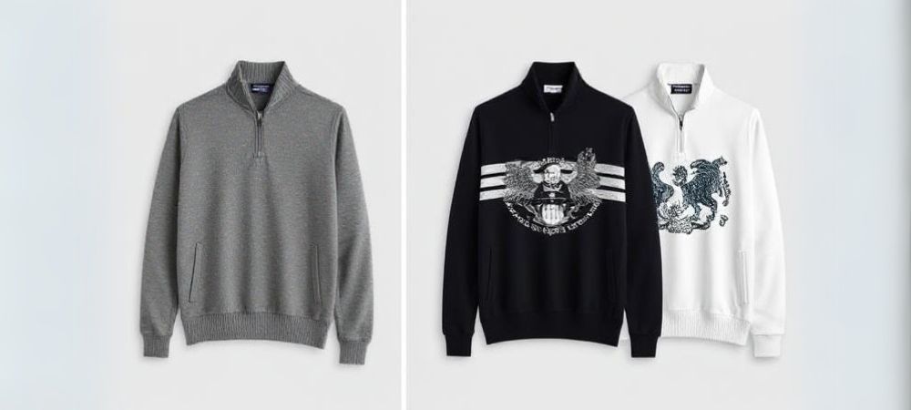
When designing polos or half-zips for corporate or formal settings, oversized or cartoonish graphics look unprofessional. The Solo Custom Piqué Cotton Half-Zip Pullover is elegant and sleek, but ruin it with a playful, oversized image, instantly appearing off-brand.
Design Tip: Keep businesswear clean, subtle, and logo-focused. Avoid cluttered visuals or slogans.
En resumen
Designing custom clothing is both an art and a science. From avoiding print over seam lines to selecting readable fonts, each step matters in creating a product that looks professional and feels intentional. By steering clear of these top custom clothing design mistakes, you’ll enhance visual impact and extend the wearability and appeal of your custom apparel.
Looking to bring your vision to life with premium fabrics and industry-leading craftsmanship? CLIFTON also offers fully customizable performance tees, ideal for budget-conscious teams or events, with any design, color, logo, or name you choose.
Shop from CLIFTON Clothing today and explore our elite options to elevate your next custom design for clothing.
Preguntas frecuentes
What are common design mistakes for custom t-shirts?
Common mistakes include printing over seams, using low-resolution files, poor font choices, and not matching colors to garment material.
How can I make sure my custom clothing design prints well?
Use high-resolution images, check garment material compatibility, and convert your design to CMYK or Pantone formats for accurate color output.
What should I avoid when designing custom apparel?
Avoid complex embroidery, printing over zippers or seam lines, using copyrighted artwork, and placing graphics without proportion or alignment.
How do you prepare a design file for custom clothing?
Save designs in vector format or 300 DPI PNG. Convert colors to CMYK for printing or PMS for embroidery. Keep fonts readable and avoid small details.
Why do custom shirt designs look bad?
Low-resolution files, poor placement, mismatched colors, or illegible fonts often result in unprofessional-looking shirts.
What are the biggest mistakes in merch design?
Designing without considering fabric type, ignoring legal permissions, using oversized graphics on formal wear, and overlooking thread limitations in embroidery.

 EN
EN NL
NL ES
ES DE
DE FR
FR