30-Second Summary
- Explore how strategic use of color impacts custom sportswear design, player psychology, and team branding through 13 powerful, handpicked palettes.
- Discover CLIFTON Clothing’s top-quality products that perfectly align with these color strategies.
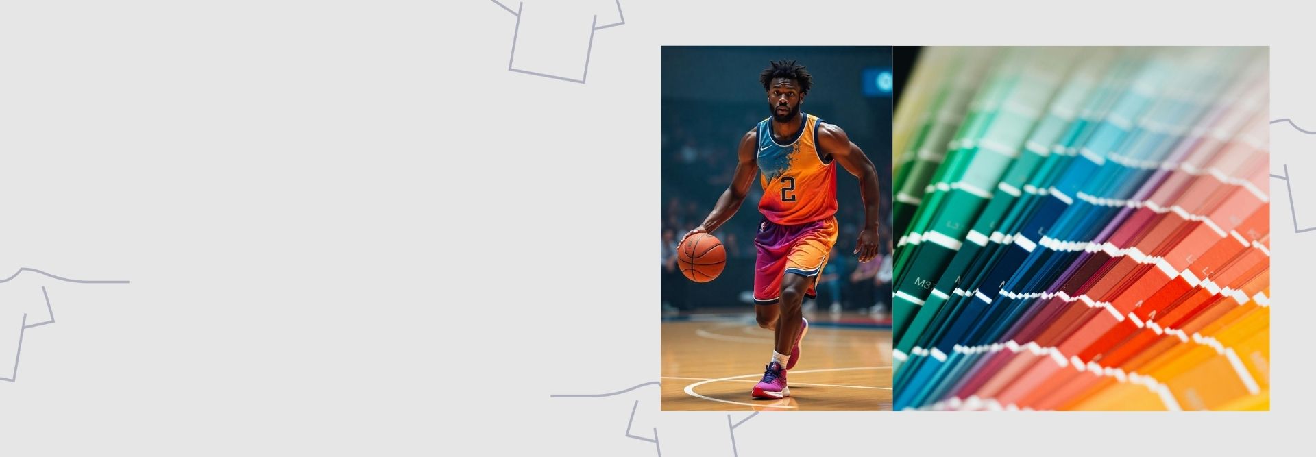
Before a player makes a move, their colors speak. In sports, color isn't just seen, it’s felt. The right sports color palette can rally a team, rattle the opposition, and ignite fan loyalty. It's not just about looking good but about playing purposefully. Color influences mindset, energy, and perception on and off the field. From fiery reds that demand attention to cool blues that sharpen focus, each hue carries power.
Today’s most innovative teams and designers use color as a competitive advantage, merging psychology with performance. At CLIFTON Clothing, we bring that vision to life with custom sports apparel design tailored to win hearts and games.
13 game-changing palettes
1. Bold Power: Crimson Red and Black
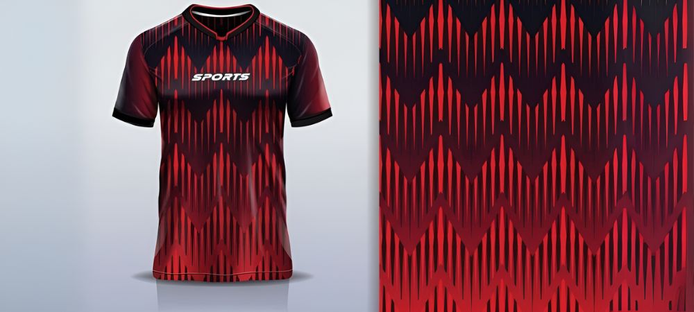
Crimson red represents strength and passion, while black adds authority and seriousness. This palette is commonly used for high-impact sports like football and hockey.
Teams that want to dominate the field with aggression and intensity often opt for this combination. Consider the Piccadilly Custom Ice Hockey Jersey for a striking visual, ideally suited to carry this fierce duo.
2. Energy Boost: Yellow and Flame
Yellow exudes positivity and energy. Flame enhances the warmth, creating a vibrant, energetic vibe. Together, they signal confidence and fast-paced action.
This palette is ideal for teams that rely on speed and agility. It’s particularly popular in youth sports and soccer.
3. Timeless Class: White and Navy (Midnight Blue)
White signifies purity and clarity, while midnight blue offers depth and tradition. Together, they create a balanced, classic look.
This combination fits seamlessly into personalized sports team shirts, giving your team a crisp, clean image.
4. Sleek Strength: Gray and Black
This palette is sophisticated yet powerful. Gray softens the starkness of black while retaining authority.
Teams that want a modern, minimalistic look favor this style. It pairs beautifully with the Malachy Custom Zip-Up Cotton Tracksuit for a refined track and training wear aesthetic.
5. Victory Spirit: Gold and Forest Green
Gold symbolizes victory. Forest green represents growth and stamina. The two together suggest a strong, winning mindset.
This is ideal for championship teams or institutions with a legacy of performance. The tone feels both grounded and elite.
6. Dynamic Warmth: Light Salmon and Tan
Light salmon offers softness and approachability. Tan adds a neutral tone that balances the warmth.
This palette works well in summer leagues and lighter team activities. It creates a friendly, approachable identity while remaining distinct.
7. Youthful Motion: Powder Blue and Light Yellow
Powder blue is calm and youthful, while light yellow brings freshness. They form a fun, easygoing vibe for school and community teams.
This palette is cheerful and eye-catching if you’re designing custom sports tee shirts for junior teams.
8. Elite Sophistication: Deep Pink and Midnight Blue
This bold palette mixes confidence and control. Deep pink grabs attention, while midnight blue keeps the look grounded.
Ideal for teams that want to make a unique, standout statement. It works exceptionally well for indoor sports and fan merchandise.
9. Nature Drive: Jade and Saddle Brown
Jade speaks of vitality and health. Saddle brown adds natural strength and tradition. This color combo is excellent for cross-country teams, nature races, and athletic events linked with the outdoors.
It looks especially effective in rugged, breathable pieces like CLIFTON’s tracksuits or outdoor warm-up gear.
10. Focused Calm: Thistle and Teal Blue
Thistle has a soft, muted appeal. Teal blue provides depth and focus. This blend is often used for women’s sports or co-ed teams that want a calm yet powerful presence.
It is soothing without losing energy, making it ideal for practice uniforms or yoga-inspired teamwear.
11. Competitive Boldness: Orange and Petrol
Orange signals urgency and drive. Petrol adds a cool, modern edge. This combination speaks to highly competitive sports like basketball or rugby.
It’s edgy and eye-catching, perfect for teams that want to push limits. Use it for aggressive branding campaigns or energetic uniform reveals.
12. Team Legacy: Maroon and Gold
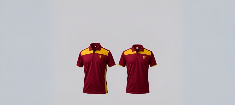
Maroon color holds heritage and tradition. Gold adds victory and luxury. Many college and university teams prefer this potent blend.
The Ranelagh Custom Cotton-Fabric Polo Team Shirts carry this palette exceptionally, offering premium team gear with a formal twist.
13. Balanced Energy: Sky Blue and Yellow Green
Sky blue suggests clarity and confidence. Yellow-green offers freshness and renewal. Together, they balance calm with energy.
This palette is widely loved in track and swimming, where focus and endurance matter. It's also trending in custom sports apparel design for professional-level kits.
Importance of Color Psychology in Sportswear
Colors do more than decorate. They evoke emotions and affect performance. Warm tones like red and yellow raise excitement. Cool colors like blue and green improve focus.
Understanding this helps you choose the right sports color palette that aligns with your team's goals. The right colors matter whether you motivate your players or intimidate your rival.
Designing Around Functionality and Style
Sportswear isn’t just about visuals; it must be functional. Breathability, stretch, and comfort are essential. However, color remains a central tool in visual branding and team spirit within those limits.
CLIFTON Clothing understands this perfectly. Their designs incorporate meaningful colors with high-quality materials, thus ensuring your team performs and looks elite.
Fonts and Colors: A Powerful Combo
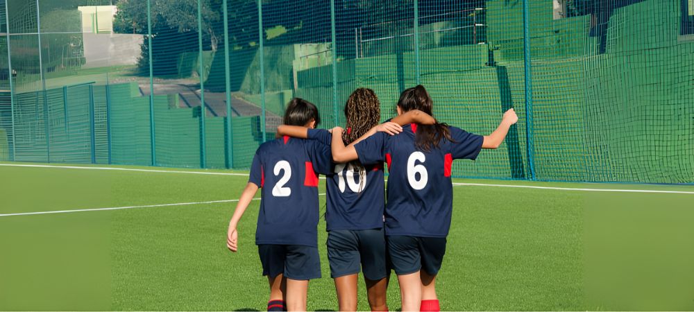
While colors dominate the visual tone, typography brings identity. Using the best fonts for sports uniform design strengthens branding and visual recall. Bold, sharp fonts pair well with intense color palettes like red and black. Soft fonts work with lighter tones such as sky blue or thistle.
Consistency between fonts and color palettes creates a professional, cohesive look that is a key to popularity in today’s visually driven world.
Conclusion:
Choosing the right sport color palette is not just about style. It reflects your team’s values, boosts morale, and creates an emotional connection with fans.
Each palette has a unique psychological effect, from bold reds to calm blues. When paired with elite-level products from CLIFTON Clothing, your team not only plays like champions but looks like them, too.
Shop your next set of premium, custom-designed uniforms with CLIFTON Clothing today, where design meets performance.
FAQs
What are good color combinations for sports teams?
Good combinations include black and red for intensity, blue and white for calm authority, and green and gold for natural strength and achievement.
How do colors affect sports performance?
Colors influence emotion and energy. Red may boost aggression, while blue promotes calm focus. Teams use this to gain a mental edge.
What do different colors mean in sports?
Colors symbolize various traits—red for power, blue for loyalty, green for growth, and gold for success. Teams pick colors that align with their identity.
How do you pick colors for a sports logo?
Start with your team’s values, sport type, and audience. Choose colors that represent emotion and contrast well for visibility.
What are the most popular sports team colors?
Due to their visibility and psychological impact, black, red, white, and blue are classic favorites.
What colors create energy in sportswear?
Colors like orange, flame, yellow, and red generate excitement, motivation, and alertness.
What are intimidating sports colors?
Black, red, and crimson are considered intimidating because they signal strength, aggression, and dominance.
How do you use color theory in sportswear design?
Apply warm colors to energize and cool colors to calm. Contrast dark and light tones to improve visibility and psychological impact.
What sports palettes are trending?
Palettes like gold and forest green, crimson and black, and powder blue with yellow are trending for their bold yet balanced appeal.

 EN
EN NL
NL ES
ES DE
DE FR
FR