30-Second Summary:
- Master the essentials of T-shirt design, from logo placement to font pairing, and learn how to bring your ideas to life using CLIFTON’s online design tool.
- This guide helps businesses, teams, and creators design custom sports T-shirts and trending T-shirt designs that look professional, cohesive, and on-brand every time.
Designing a T-shirt isn’t just about picking colors and adding a logo. It’s about creating an identity, something that represents your brand, event, or team in a way people instantly recognize. Whether you’re a corporate brand manager, a student club leader, a sports coach, or a small business owner, your T-shirt design is often the first impression your group makes.
This comprehensive t-shirt design guide will help you understand how logo placement and font selection can transform an ordinary tee into a wearable statement piece. Moreover, if you’re using CLIFTON Clothing’s online design tool, you’ll discover just how easy it is to customize t-shirt design perfectly, down to the last pixel.
Let’s dive into the art and precision of creating custom designs for clothing that don’t just look good, they make people want to wear them again and again.
1. Why Logo Placement and Fonts Matter More Than You Think
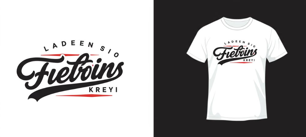
In apparel design, placement and typography are two small details that have an enormous impact. Together, they determine how your message reads, how your logo feels, and how professional your shirt looks.
- Logo placement influences visibility and balance. A logo positioned slightly off-center can make a shirt feel awkward.
- Font choice influences tone, Times New Roman conveys tradition and reliability, while Arial feels modern and approachable.
For businesses, the right placement ensures your logo is visible during events, photos, and day-to-day wear. For students, influencers, or coaches, the right design helps your group stand out and look coordinated, not cluttered.
2. Understanding Logo Placement: The Art of Positioning Your Brand
When creating custom sports t-shirts or company uniforms, where you place your logo is as important as what the logo looks like. Let’s break down the most effective placement options, all fully supported by CLIFTON’s online T-shirt designer.
Front Placement: The Statement Spot
Best For: Businesses, events, universities, and clubs.
The front of the shirt is prime real estate for your brand. A small logo on the left chest area (typically 3–4 inches wide) gives a professional, understated look, perfect for corporate or staff uniforms.
Center-front placement works best for expressive designs, like event shirts or custom sports t-shirts, placing your message or artwork at the focal point.
Pro Tip: Use the grid feature in CLIFTON’s design tool to center your logo horizontally and vertically. A centered logo creates a sense of symmetry and visual harmony that immediately looks professional.
Back Placement: The Bold Billboard
Best For: Events, sports teams, or merchandise collections.
The back is perfect for large logos, slogans, or numbers. This space allows you to be bold and maximize brand visibility from a distance. For sports teams, player names and numbers often go here, while companies use this area for event names or taglines.
Important Note: It’s completely fine for your logo on the back to be much larger than the front logo. It’s a common and effective practice: the small front logo keeps things refined, and the bold back print maximizes visibility.
Sleeve Placement: The Subtle Power Move
Best For: Teams, fashion lines, and businesses looking for a refined touch.
Sleeve logos add a subtle yet powerful touch. They give your shirt a finished, premium feel and are perfect for custom designs for clothing that aim for a clean, branded look.
CLIFTON Tip: If you want logos on the arm facing out, simply place them that way in the CLIFTON Clothing design tool. Our design team understands that means“facing out” just like in the reference example above.
This placement works especially well for corporate apparel, where subtle branding goes a long way.
Hem or Side Placement: The Modern Minimalist Approach
Best For: Trendy startups, influencers, and modern brands.
Small logo placements near the bottom hem or side seam give your shirts a streetwear-inspired aesthetic perfect for trending t-shirt designs. This style signals that your brand pays attention to detail, which resonates with Gen-Z and creative entrepreneurs alike.
3. Font Selection: Giving Your Words a Visual Voice
Typography can make or break your T-shirt design. Whether you’re printing a company slogan, team motto, or event tagline, your font choice affects how people interpret your brand personality.
Understanding Font Styles
- Serif Fonts – Serif fonts like Times New Roman or Georgia have decorative strokes, conveying tradition, trust, and professionalism, ideal for corporate or charity events.
- Sans-Serif Fonts – Clean and modern, fonts like Lemon Milk or Montserrat feel youthful and energetic. Great for tech startups, student clubs, and sports teams.
- Script Fonts – Flowing and elegant, script fonts like Pacifico add personality but should be used sparingly for readability.
- Display Fonts – Bold and attention-grabbing, these work best for one-word statements or designs meant to go viral on social media.
Choosing Font Pairings That Work
A good rule for T-shirt typography: Limit your design to two fonts, one bold headline font paired with a simple body font for contrast and balance.
For example:
- Montserrat Bold (for your main slogan)
- Ostrich Sans Medium (for your tagline)
This approach ensures your text feels cohesive, not chaotic. You can explore these combinations directly in CLIFTON’s design tool while customizing your T-shirt.
4. How to Customize Your T-Shirt Design on CLIFTON
The easiest way to bring your creative idea to life is by using the CLIFTON Clothing online designer, an intuitive tool that gives you full control over your custom design for clothing.
Here’s how to get started:
- Go to CLIFTON’s product selector.
- Choose your preferred shirt style and color.
- Upload your logo, slogan, or artwork.
- Experiment with placements; front, back, or sleeves.
- Adjust the font, size, and color to match your brand guidelines.
You can even rotate or resize your design elements easily. Also, as mentioned earlier, if you place your sleeve logo facing out, Our production team automatically interprets it for printing.
The entire process ensures that what you see on your screen matches what’s delivered to your door, exactly how your team envisioned it.
5. Common Mistakes to Avoid in T-Shirt Design
Even experienced designers can miss details that make a huge difference in the final look. Avoid these common pitfalls:
1. Oversized Front Logos
A massive logo on the chest can overwhelm the design and make the shirt look unbalanced. Keep the logo within 3–4 inches wide for a clean, professional finish.
2. Using Too Many Fonts
Mixing multiple fonts looks chaotic. Stick to one or two typefaces that complement each other.
3. Poor Contrast
Always ensure your text color contrasts well against the shirt background. White on light gray or yellow on white, for instance, will disappear under certain lighting.
4. Ignoring Sleeve Orientation
Remember to position sleeve logos facing out on the design tool if that’s the look you want. CLIFTON’s system recognizes that placement automatically.
6. Designing for Different Groups: Tailored Tips for Every Buyer Avatar
Each group designs shirts for different reasons, but they all want a design that looks polished and professional. Here’s how each audience can use this guide to achieve their goals:
For Corporate Brand Managers
You want professionalism and unity. Go for minimalist logo placement, small chest logo, sleeve tag, and clean fonts like Maison Neue. Use your brand colors to reinforce recognition. When you customize t-shirt design for your staff, consistency is everything.
For Event Organizers
Your design needs to stand out in photos and videos. Choose a bold back design with the event name or hashtag, and keep your front logo minimal. Fonts like Bebas Neue make slogans pop and are ideal for short phrases.
For School and College Teams
Go with energetic, youthful fonts and vivid colors that reflect school pride. Try large chest prints and sporty sleeve logos for custom sports t-shirts. Add personalization options like player names or batch years.
For Small Business Owners
Subtle branding speaks volumes. A clean logo on the left chest and a small tagline on the sleeve creates an upscale look for your café, salon, or startup. Stick to modern sans-serif fonts that align with your brand image.
For Nonprofits
Keep designs simple and message-driven. Use legible fonts like Round Italic or Griena, and place your logo front and center. Avoid flashy designs, clarity and unity matter more than complexity.
For Coaches and Team Managers
Use performance fabrics and bold lettering. Position your logo on the front, player names on the back, and sponsor logos on the sleeves. CLIFTON’s moisture-wicking custom shirts keep your athletes comfortable while showcasing your team identity.
For Creators and Influencers
Trendy, expressive, and eye-catching, your design should tell your story. Use trending t-shirt designs like minimalist prints or logo typography. Play with placement, small front logo and large back text is currently one of the hottest looks.
7. How CLIFTON Clothing Makes Customization Effortless
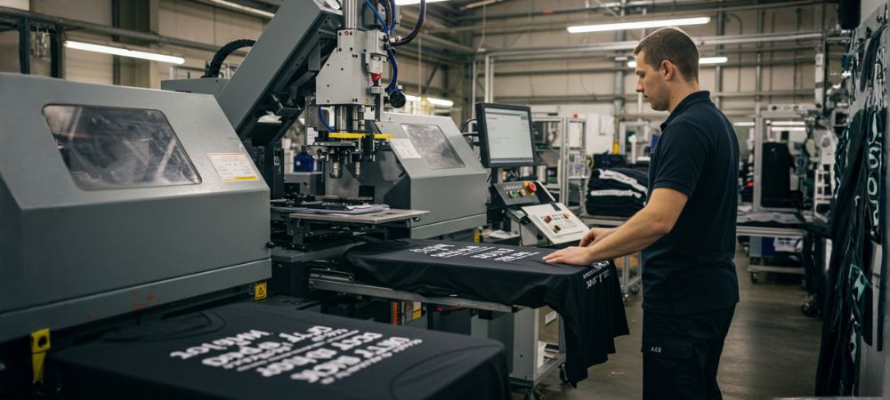
CLIFTON Clothing bridges the gap between creativity and execution. Every shirt you design is backed by professional production standards, ensuring crisp prints, accurate colors, and consistent sizing across all quantities.
- Precision Printing: High-definition print quality that captures every detail.
- Durable Fabrics: Soft, breathable, and made for daily wear.
- Easy Online Design Tool: No design experience required.
- Bulk Ordering Made Simple: Ideal for teams, events, and corporate orders.
Whether you’re creating 10 shirts for a startup launch or 500 for a college event, CLIFTON ensures your custom design for clothing reflects your brand’s identity flawlessly.
Takeways
Designing a T-shirt that looks professional, feels comfortable, and captures your brand essence doesn’t have to be complicated. It’s all about strategic choices, where to place your logo, how to pick your fonts, and ensuring color consistency.
Whether you’re crafting custom sports t-shirts, creating merchandise for your next event, or designing uniforms for your staff, CLIFTON Clothing provides everything you need from expert design tools to flawless printing and delivery.
Start designing now at CLIFTON Clothing’s Online Designer and turn your creative vision into a perfectly printed reality.
FAQs
1. How do I choose two fonts that look professional together and aren’t overused?
Pair contrast with simplicity. Choose one strong headline font and one neutral supporting font. Avoid overly decorative or widely used combinations like Arial + Times New Roman; they feel generic.
2. Is it okay for the logo on the back of a shirt to be much larger than the one on the front?
Yes, absolutely. This is common practice. A small front logo looks neat, while a large back design ensures visibility from a distance. Many CLIFTON clients use this layout for events and sports teams.
3. What’s the biggest mistake people make with logo placement that makes a shirt look cheap?
The most common issue is misalignment logos placed too close to seams, collars, or edges. Always center your design properly using CLIFTON’s grid guides. Balance and spacing are key to a premium look.
4. How do I make sure the colors on the screen will look the same on the final printed t-shirt?
Use Pantone or HEX color codes, and avoid oversaturated digital tones. CLIFTON’s printing technology ensures accurate color translation, but providing exact codes helps achieve the closest possible match.

 EN
EN NL
NL ES
ES DE
DE FR
FR